In the Summer 2018 Bulletin we broke down branding concepts, and what makes your brand noteworthy. You might now be considering whether your brand is working as hard as you are, which brings us to the idea of a Rebrand or brand refresh.
Have you ever looked at your work boots and thought about whether it was time to buy new ones, fix them or just deal with them for a little longer? Well your brand should be considered in the same way. We recently had a Angus producer discuss his need for a new brand but not wanting to give up the familiarity and recognition that his stud already had, which is where we suggested a brand refresh.
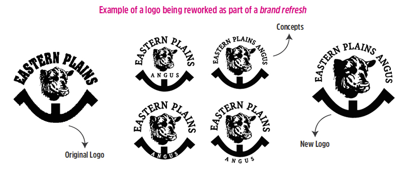
A brand refresh is essentially a renovation, you keep the bones – be it your name, colours or logo – but you re-imagine the look and feel of it. One way is to update but keep a visual connection. In this case you could rework your logo instead of remake from scratch, like updating your logotype to a more modern font or simplifying a complex logomark to fit in with a more modern audience. You can then base your new or updated design elements from that.
A rebrand is an opportunity to start from scratch and build your image again. This could be because for many reasons, for example, your business has outgrown its identity or there has been a fundamental change in your business. It involves redesigning the brand name, logo and visual elements, and anything that flows on from this.
Basically, if you are changing the name or logo significantly it is a rebrand, but if you are changing anything else it is a brand refresh.
When considering either a rebrand or brand refresh it is important to consider the impacts of both and do your research into what will suit you the best. This is the representation of you, so you want to be displaying your best self.
Different types of logos
There are many different types of logos, but here is a basic breakdown of the 3 main types:
Logotype – These are stylised logos that spell out a company name. More often than not a larger organisation that utilises a logo like this will have a font created for use in their branding based off their logotype. Examples include Facebook, Google and Nestle.
Logomark – Simple but dynamic, these are designed to be instantly recognisable. When utilising this type of logo, many business have alternative versions that incorporate the company name. Examples include Apple, Target and Nike.
Combination mark – Incorporating both a symbol or icon and the company name, these logos – if well designed – can be separated for different applications or used as a whole. This is an ideal choice for new businesses. Examples include Microsoft, Reebok and Hallmark.
When designing or reworking a logo, bear in mind that your logo is not your brand, but design element that is a part of your overall brand.
![]()